How to Create a Pitch Deck Investors Want to See

If there’s one thing I’ve learned from “VC Twitter”, it’s that a lot of founders struggle to create great pitch decks.

After hours of researching, reviewing pitch decks, and reading through some heated debates on social media, the problem is clear:
There’s a disconnect between what founders think they should include in their pitch decks and what investors actually want to see.
As a founder, you’re naturally enthusiastic about your startup. As a result, you’re tempted to pack your pitch deck with tons of information to convince investors to give you money.
On the other hand, investors look at hundreds of pitch decks every year. In any given week, investors meet with dozens of founders. In case you think we’re exaggerating, here’s a peek at one VC’s calendar.
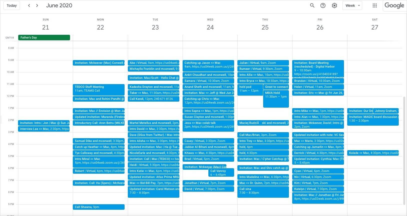
So we have one group (founders) that’s eager to share their startup with the world, and another group (investors) that has limited time and gets pitched all day.
Do you see the problem?
How do you create a pitch deck that explains what your startup does and why it’s a great investment, while also being succinct enough to hold an investor’s attention?
Read on to learn how to make a pitch deck investors want to see and increase your chances of getting funded.
What Should Your Pitch Deck Include?
Creating a pitch deck is a lot like writing a story. There are five essential elements of a good story:
- Characters
- The setting
- The plot
- The conflict
- A resolution
Without these five elements, the story feels incomplete. And if you change any of these elements, you have a drastically different story. Just imagine if Star Trek took place underwater instead of in space, or if Ron was the main character in Harry Potter instead of Harry. How different would those stories be?
Your pitch deck is similar. While no two decks are the same, there are certain elements investors expect to see because they help tell the story of your startup.
Without these elements, your pitch deck feels incomplete. Also, the content of each element is what will ultimately capture the investor’s attention and help you get funded.
So, what exactly are the elements of a good pitch deck?
Here’s a list to get you started.
Problem
Just as a good story needs conflict, your pitch deck needs to outline the problem that your startup is solving.
Be crystal clear about what the problem is and who it affects. Even if the investor(s) you’re pitching don’t experience the problem you’re solving, they should understand how deep of a pain point it is and why it needs a solution.
Twine does an excellent job describing the problem their product solves with their pitch deck. It was compelling enough to help them raise over $1 million.
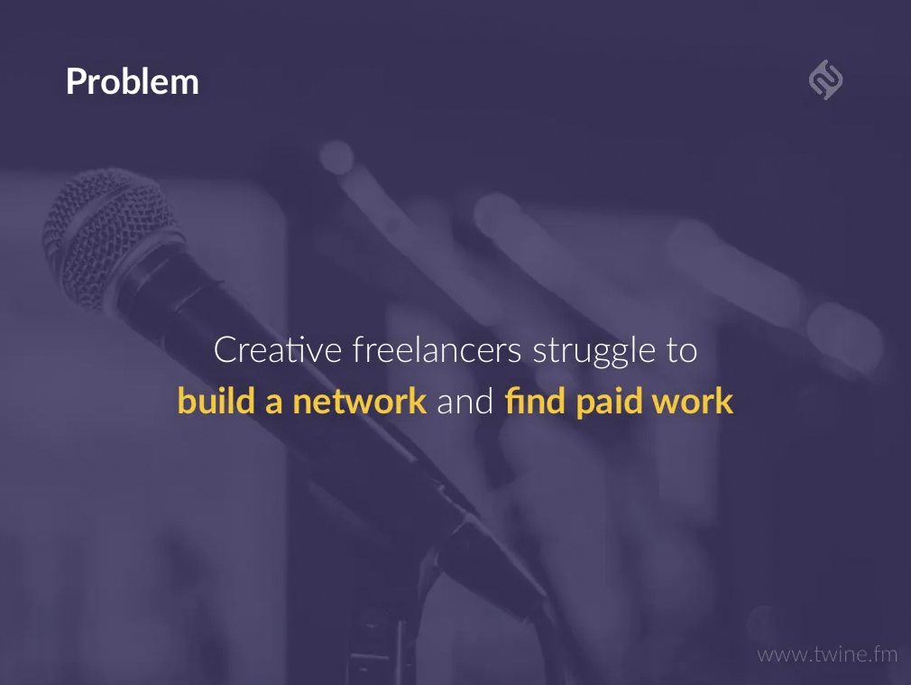
Tip: Using trigger words like struggle, frustrated, and desperate adds an emotional element to your deck and makes the pain point feel more visceral to investors.
Solution
Your pitch deck also needs to explain how you plan to solve the problem. Do you have a new solution for an existing problem? Do you have an improved version of an existing solution?
This is typically the first slide where you’ll introduce your product to your investors, so make it compelling. Also, avoid jargon and “marketing talk”.
For instance, if you’re pitching email marketing software, don’t describe your solution as “an innovative approach to connecting customers and businesses.” It’s vague and leaves too much room for interpretation. Instead, you could go with something like “A simple drag-and-drop email marketing tool for daycares”.
If you can’t explain your solution in a simple and cohesive statement, chances are your investors will have a difficult time understanding what you’re pitching.
Take a look at this example from the Public Goods pitch deck. They do a great job of using visuals to illustrate the problem in their market and how they solve it.
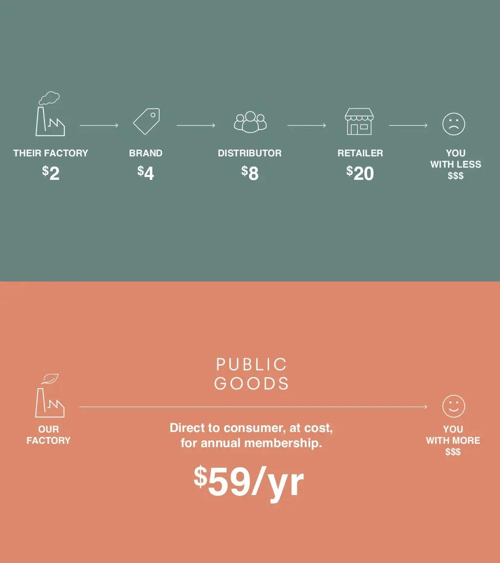
One of the best things Public Goods did with their slides was explaining their problem and solution in as few words as possible.
I won’t say any names, but I’ve gone through A TON of pitch decks where the problem/solution slides are jam-packed with text. That makes it difficult for investors to decipher the main takeaways or to even retain the information.
If you take nothing else from this guide, let it be this—keep it simple.
Market
The reason VCs and angels invest in startups is that they want to strike big.
It’s widely accepted that most startup investments don’t generate a significant return on investment (if any) because most startups fail. Investors hope that the big wins from one or two of their investments will more than cover the losses from the failed startups.
Because of this, most investors want to know that your company has the potential to be big. We’re talking VERY big. One metric that founders use to show how big the need is for their product is total addressable market (TAM).
TAM is an estimate of the most amount of revenue you can generate by selling to a specific market. TAM isn’t meant to be an exact number, but more of a way to paint a picture of how much demand there is for a solution in your market.
If your TAM is a couple million, that’s not going to be very appealing to investors. However, if you’re tackling a $2 billion market, that shows investors your market is large enough to generate hundreds of millions in annual revenue, which is much more compelling.
Winnie, an online marketplace for millennial parents, does a great job of outlining their market in their pitch deck, which led to them raising a $2.5 million seed round.

This slide shows that their market is not only huge ($1 trillion) but also growing (90% of new parents are millennials). That’s the type of opportunity investors love to hear about.
One word of caution though. Don’t grossly overestimate your TAM to make your company seem more appealing to investors. Do research to come up with a realistic TAM so you’re not misleading investors.
Competitors / Competitive Advantage
Who are your competitors and what makes you different from the current solutions?
One important thing to keep in mind here is that competitors don’t always have to be other brands.
For instance, if your business sells compact trash cans for small cars, one of your competitors is likely plastic grocery bags since that’s what a lot of people use to throw away trash in their car. In the world of SaaS, your competitors might be spreadsheets.
The question isn’t “what other companies are solving the problem?”, it’s “how are consumers solving the problem today?”
When it comes to how you present your competitors in your pitch deck, consider this piece of advice from founder and angel investor Lance Cottrell:
“A lot of competitor comparisons are just a list of features. Unless we are your target customer, we may not know if those are exciting features or not.”
Instead, Cottrell suggests you focus on the benefits of your solution instead of features.
Here’s what a typical comparison chart focused on features looks like:

Notice how it’s filled with jargon that the founder might know, but someone not in the rocket ship industry would be completely confused.
Now, here’s what a benefits-focused comparison looks like:

The difference between your startup and the competitors (SpaceX and NASA) is easy to understand even if you don’t build rocket ships.
Tip: When you’re creating a competitor comparison chart, focus on your biggest differentiators that would cause consumers to choose your company over other solutions.
Your Team
Investors want to know that you have the right team in place to solve the problem. Use this slide to highlight the key players in your team and what they bring to the table.
This is particularly important when you’re raising a pre-seed or seed round and are still building your foundation. When you’re that early on, investors are investing in your team just as much as your business.
Do you have people on your team with previous success in your industry? Notable industry experts or influencers? Highlighting these folks can make investors feel more confident and comfortable investing in your startup.
Take a look at the “Our Leadership Team” slide of Almanac’s pitch deck for their seed round.

They do a great job of highlighting:
- Notable companies they’ve all worked with
- Companies they’ve worked with that have been acquired
- Experience relevant to this new startup
Use this slide as a highlight reel of your team’s experience.
Business Model
How are you going to make money?
While you’ve probably heard of some wild valuations and funding rounds for pre-revenue startups, the truth is that investors want to know how you plan to generate revenue.
What’s your revenue model? What’s your customer acquisition strategy? Are you product-led, marketing-led, or sales-led? If you already have customers, what do your current acquisition, conversion, and retention numbers look like?
There’s no shortage of good business ideas out there. The challenge is turning those ideas into a high-growth startup. Use this part of your pitch deck to show investors how you’re going to grow the business.
Here’s an example of how Odeko’s pitch deck makes it easy for investors to understand how the company generates revenue:
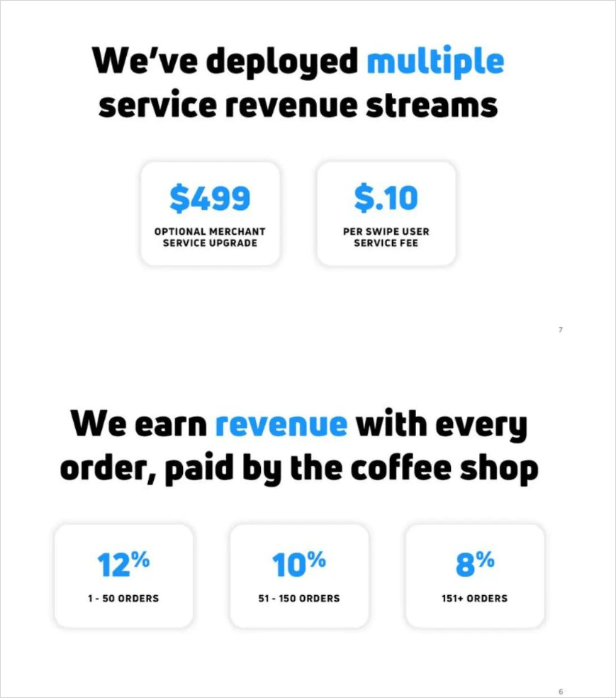
Investors also want to see that you have a plan for how your company is going to get customers or users. In Dropbox’s pitch deck, they were clear about how they planned to get initial users, and they ended up executing their plan.
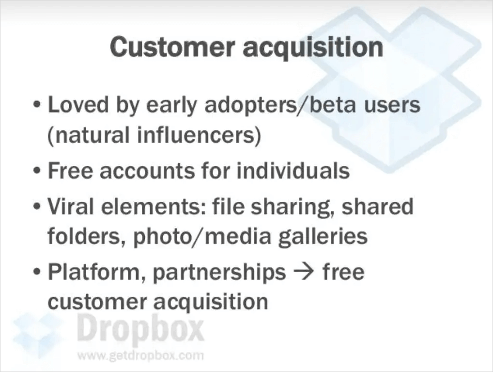
You don’t need to spell out your entire acquisition strategy piece by piece. Just focus on the high-level plans for how you plan to get customers and how you’ll monetize.
Financials
Your story is important, but you also need to know your numbers. Investors want to know that your business is financially viable. The best way to show this is with your financial model.
Think of your model as the financial blueprint for your business. Among other things, it answers two very important questions for investors:
- How will your revenue grow over the next few years?
- How much will it cost to grow your business?
Traditionally, founders use spreadsheets to create their financial models. The problem with that though, is spreadsheets aren’t visually appealing in a pitch deck. They’re also not easy to update which is very important when you’re fundraising as a startup.
That’s why I highly recommend using a tool like Finmark to prepare your financial model for investors instead.
Not only is it easy to build your model, but all your data is visualized in easy-to-read graphs and charts. That way, you can easily show investors your revenue forecast, burn rate, and other financial metrics they want to see.
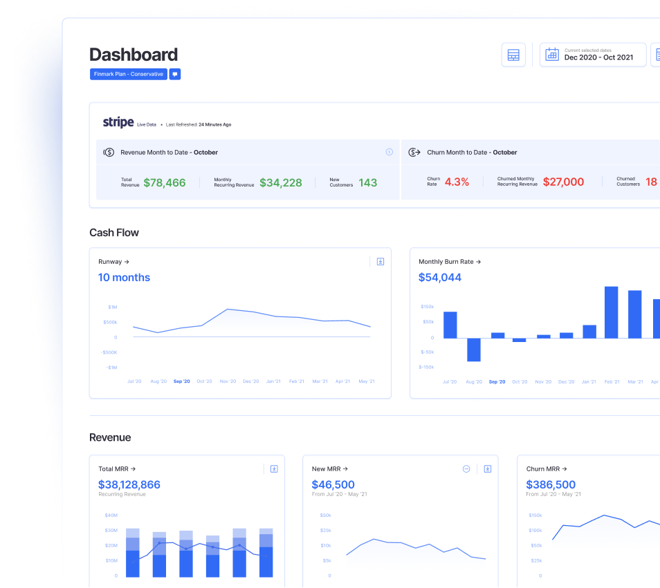
Learn more about how Finmark makes fundraising easier.
The Ask
It might sound obvious, but you’d be surprised by how many founders don’t include what they’re asking for in their deck.
Your pitch deck should include:
- The amount of money you’re raising
- When you’re closing the round
- How much money you’ve raised from other investors
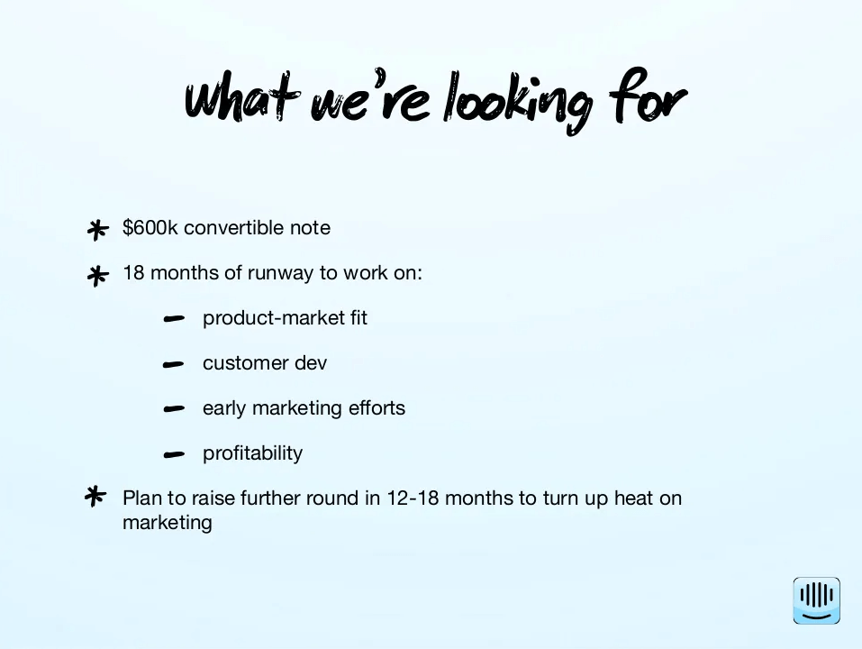
- Your plan for the investment (including how long you expect this investment to last before you raise your next round)
That last bullet point is very important. Investors want to know how you plan to use their investment.
Even if you’ve alluded to it in previous slides, you should have a slide in your pitch deck that states exactly what you plan to do with the investment and what milestones you hope to achieve with it.
For instance, do you plan to expand your team, spend more on customer acquisition, or something else entirely?
If you need some inspiration, look no further than Intercom’s seed round pitch deck:
How to Make Your Pitch Deck Stand Out (According to Investors and Funded Startups)
Even if you have all the sections in your pitch deck outlined above, that doesn’t automatically make it a great deck. The content of your deck is what will separate it from the rest.
Here are some tips to make your pitch deck stand out to investors.
Think of Your Pitch Deck As a Children’s Book, Not a Fantasy Novel
I love this tip from Saba Karim, Head of Pipeline at Techstars:

As a founder, it’s easy to get into the weeds when you’re talking about your startup. You want to make sure you’re not leaving anything out and you likely have a lot to talk about.
That level of excitement is great, but it can also result in making your pitch deck too long and unnecessarily wordy.
Keeping your deck simple will not only make it easier for investors to understand, but it’ll also make them more engaged since they’re not reading paragraphs on your slides.
Here’s a great example from the Coinbase pitch deck.
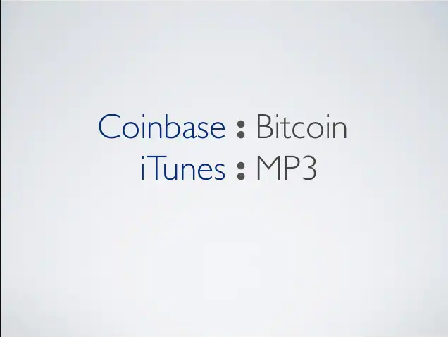
The world of cryptocurrency was very new when Coinbase was raising its seed round in 2012. As a result, a lot of investors weren’t familiar with the concept of what Coinbase was building.
Rather than dive into a bunch of technical jargon, this slide from their deck makes it crystal clear what Coinbase does by comparing it to a product people are already familiar with.
If simplicity is something you struggle with, consider hiring an editor to trim things down and help you condense your slides. It’ll be well worth it.
Create a Clear Narrative
Here’s another great piece of advice that most founders overlook when creating their pitch deck:

Remember what I mentioned earlier about your deck being a story? The chapters in books aren’t titled “Beginning”, “Middle”, and “End”. They’re more descriptive and add to the narrative, which helps build anticipation for the reader.
You can take the same approach with your pitch deck. Don’t feel obligated to use generic slide headers, think of ways to weave your overarching story into your headers and use the slide contents to fill in the rest.
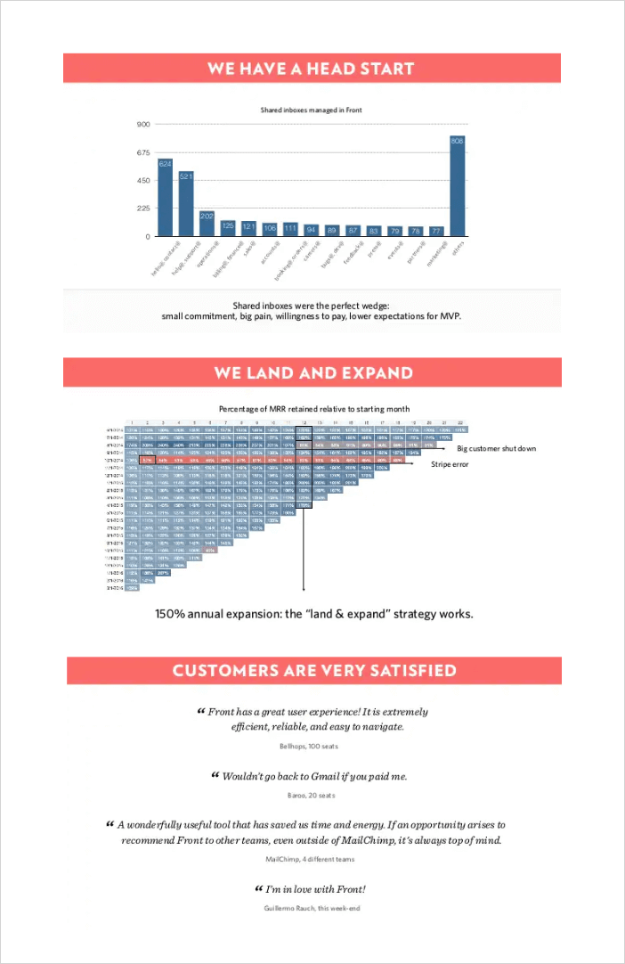
Front’s Series A pitch deck does a great job of using headers to show a clear narrative. It must have been effective since they ended up getting $10 million in funding.
Pass The Grapevine Test
Have you heard of the grapevine game?
It goes by a few different names but the gist of it is you gather people in a circle and one person whispers a “secret” to the person standing next to them. That person has to repeat the secret to the next person and so on.
By the end of the game, the last person in the circle has to say the secret out loud and see if it matches the original secret shared by the first person. Usually, somewhere along the line part of the message gets misheard or misconstrued, so the original secret gets lost.
According to venture capitalist, Clint Chao, that can also happen with your pitch deck if it’s not easy to understand:
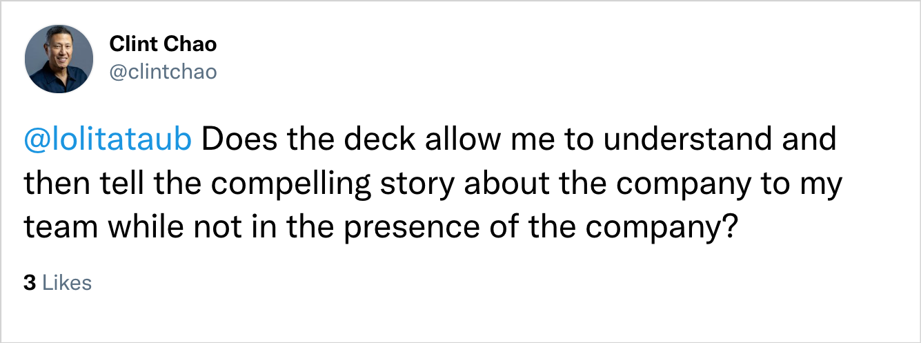
Your deck should pass the “Grapevine Test”, meaning after an investor reads through your deck and/or sits through your pitch, they should be able to explain why your company is a good investment to the rest of their team.
Unless you’re pitching an angel investor, chances are the person you’re pitching isn’t going to be the sole decision-maker on whether or not their firm writes a check.
If your deck isn’t memorable or clear enough for the person you meet with to clearly explain what your company does, the opportunity, and your differentiator without you being present, you could lose out on a deal.
Tinder’s original pitch deck (when they were called Match Box) is a great example of a deck that passes the Grapevine Test. It’s short, simple, and very memorable.

Chances are any investor they meet with can clearly explain what the app does, why there’s a need for it, and how it’s different from current solutions.
If You Don’t Have an Eye For Design, Use a Template
Your pitch deck doesn’t have to win any design awards, but it should look professional and easy on the eyes. With all the tools and resources available today, there’s really no excuse to have an ugly pitch deck.
This is coming from someone who struggles with design, so don’t take it personally. If you know you’re not great at creating decks, use a template or hire someone to handle the design (I’ll share some resources further down).
Choosing the right fonts, color combinations, text size, images, and other visual elements will make your deck easier for investors to read and understand.
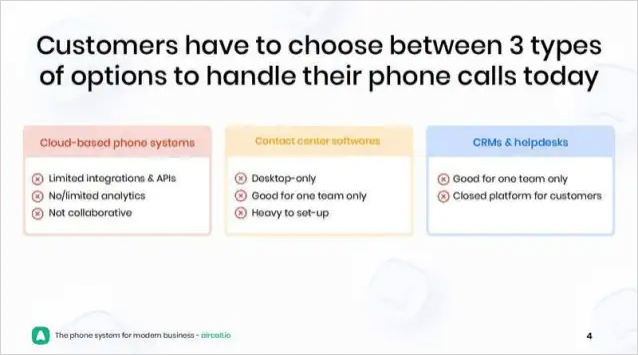
Aircall’s pitch deck is a great example of a deck that’s well designed, which makes it easier for founders to pitch and for investors to read through.
Showcase What You Know About The Market That’s New or Different
Some of the biggest companies in the past few decades were built on a new way of thinking about something that already exists.
Two of the best examples of this are eBay and Uber.
When eBay was first getting started in the ’90s, the idea of buying used products from strangers on the internet was completely foreign to most people and not at all the way people bought things at the time.
Fortunately, the founder had the foresight to know where the internet was headed and was able to secure $6.7 million in funding after he had proof of concept (users on the platform).
Uber’s story was similar, in that they had to convince founders that people would be open to getting picked up by strangers and that the current taxicab solution was broken. Their pitch deck does this by showing the current solution and how Uber reimagined the “broken” system.
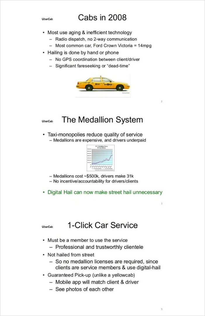
The point is, as investor Josh Kerr points out, if your deck can show that you know something about the market or even culture that’s different from “the norm”, it’ll help you stand out.

Don’t Add Unnecessary Slides
According to data from DocSend, the average pitch deck is about 19 slides.
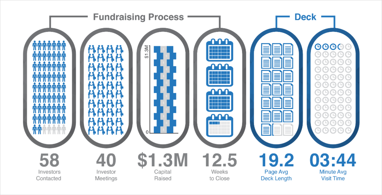
That means if you’re sending out a 40-slide deck, chances are investors probably aren’t reading the entire thing. Not only that, but they might be turned off by the idea of even looking at the deck altogether if they see all those slides.
How often have you not started a movie, book, or even a task because you knew it was going to take you a long time to get through it? That’s exactly what happens to investors when they see dozens of slides in your pitch deck.
There’s very rarely a scenario where your pitch deck will need to be much longer than 20-25 slides.
Airbnb was a startup that revolutionized the hospitality industry, and do you know how long the pitch deck was for their seed round?
Fourteen slides…

Condense your deck as much as possible without taking out critical information. Again, if being concise is something you struggle with, hire an editor to help.
Avoid Videos in Your Deck
This tip from VC, Mac Conwell, might be somewhat controversial, but it could save you from embarrassment in the middle of your pitch:
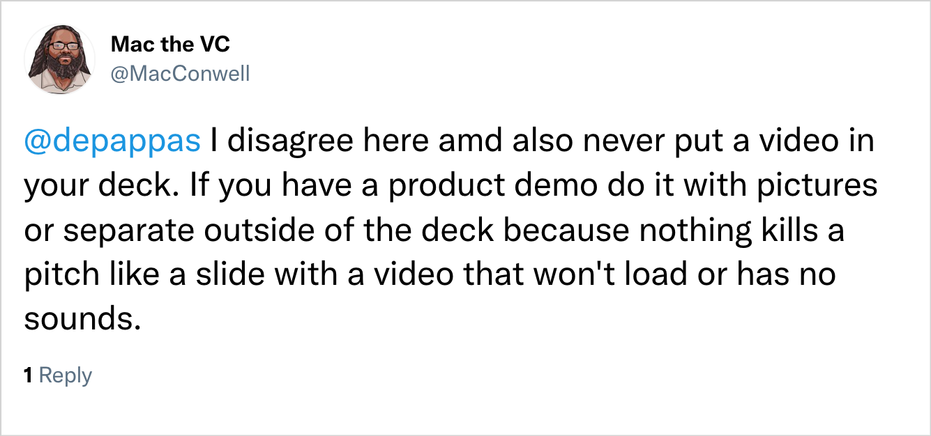
Adding videos to your deck can be risky. There’s always a chance the video won’t load, the audio won’t connect, or any number of other issues.
Therefore, if it’s not absolutely necessary, you should try to avoid adding videos to your deck.
Stick with product screenshots instead to be on the safe side. If the investors show interest, then you can follow up with a product demo or video later.
The Best Tools to Create a Pitch Deck
There are more tools available than ever before to create your pitch deck. We’ll say this though, don’t get too hung up on the tool you use for your deck. The content is what’s most important.
That said, here are some pitch deck tools depending on your preference:
If You Prefer Traditional Slideshow Tools
Want to keep it old school? You can never go wrong with PowerPoint or Google Slides. These classic slideshow tools may not have a ton of frills and extras, but they do have everything you need to create a pitch deck.
If You Prefer a Tool Specifically For Pitch Decks
With the explosion of startups and fundraising, it’s not surprising to know that there are presentation tools made specifically for pitch decks, or at least have some features that make building pitch decks easier.
Some popular options include:
If You Prefer More Design Flexibility
A lot of the trendy drag-and-drop design tools companies use to make social media graphics, infographics, and other designs also allow you to create pitch decks as well.
The benefit of using these tools is they often have many of the same features as presentation tools, but they give you more flexibility and often have a huge library of photos and graphics you can use to make your pitch deck more visually appealing.
Two of the most popular tools in this category are:
If You Prefer Something Completely Custom
All of the options we’ve listed so far are great for creating pitch decks, particularly if you’re not super design-savvy.
However, in many cases, your deck will need to be created within the constraints of what the tools offer. For instance, most presentation tools have a library of pre-built shapes and graphics you can choose from. They also have pre-built templates for you to use as a starting point.
That’s all great, but if you want something completely unique, you can go with something like Photoshop or Illustrator.
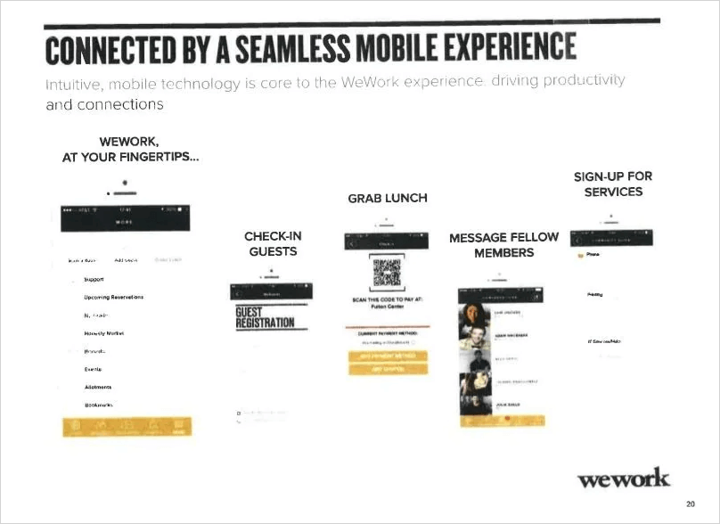
Bear in mind that it’s not necessary to completely build a pitch deck from scratch. Some of the most successful startups in the world got funded with pitch decks that look like they were made in Paint.
It’s clear that design wasn’t a top priority for WeWork’s pitch deck, but they were still able to secure hundreds of millions in funding.
If You Prefer to Leave It to a Designer
Last but not least, what if you don’t even want to be bothered with putting your deck together?
Most of the content will have to come from you as the founder, but constructing the deck itself is something that can be outsourced. There are professionals that specialize in creating amazing pitch decks.
Depending on how much you want to outsource, they can take care of anything from just the design work to helping you decide what sections to include and how to format it all.
Here are a few places to have a pitch deck built:
I can’t stress this enough though, don’t get too hung up on design. As long as your pitch deck looks professional, the design shouldn’t be an issue. Your content and delivery are what’s most important.
Pitch Deck Examples
There are a ton of articles and entire websites dedicated to pitch deck examples. So, rather than giving you a random list of the same examples, here are a few resources for pitch deck examples you can check out (it’s also where we got many of the examples we used in this article).
- Pitch Deck Hunt
- Pitchdeckexamples.com
- Slideshare (you can search for pitch decks for specific companies)
Get Your Pitch Deck Ready!
It’s clear there’s a discrepancy between the pitch decks founders make and what investors want. However, following the tips above will help close the gap so that investors don’t tune out your deck.
And if you need help preparing your financials for your pitch deck, give Finmark a try (it’s free).
This content is presented “as is,” and is not intended to provide tax, legal or financial advice. Please consult your advisor with any questions.
