Building SaaS Dashboards: 4 Examples Of Essential Reporting

The emergence of SaaS (software as a service) businesses has been one of the biggest trends in tech. From 2017 to 2022, the SaaS industry saw an annual growth rate of 18% and there are over 30,000 SaaS companies in the world today.
Yet a large number of SaaS companies fail.
Staying on top of metrics and making data-informed decisions are integral when running a SaaS company. Having strong SaaS dashboards ensures you have the information you need to keep your business thriving.
What is a SaaS Dashboard?
A SaaS dashboard reports and visualizes key performance indicators (KPIs) SaaS companies need to track. They contain key information about customer behavior, the sales process, and marketing efficiency.
A well built SaaS dashboard answers the most important questions of the people who use it. For example, the needs of a sales team are different from the needs of a customer support team. The dashboard should always reflect the user.
Using the dashboard, the SaaS business tracks progress towards its goals and objectives. But beyond that, there’s valuable data that informs strategic changes to improve performance.
Why is a SaaS Dashboard Important?
If you think about commerce as “making a sale,” SaaS companies face a unique challenge. Even once a user subscribes, you’re still “making a sale” for that customer to renew.
To maximize performance, SaaS companies need in-depth information on the sales process, customer retention, and overall value of a new customer.
Using SaaS dashboards, it’s simple and easy to stay on top of these stats to evaluate business performance. With clear reporting on these trends, SaaS businesses can:
- Determine the value of a new customer
- Identify when customers typically churn
- Project cash flow to plan spend
- Set marketing budgets and targets
- Evaluate the scalability of their operations
SaaS Dashboard Examples
To help you get started, we’ve compiled four examples of dashboards specifically for SaaS companies. These examples cover 16 key metrics that give insights into revenue, acquisition, retention, and more.
These dashboards aren’t exhaustive, but a starting point to be adjusted to your needs. The more you use dashboards, the more you’ll learn what you like to track and how you like to track it.
General Overview Dashboard
Metrics to Include
- Active subscriptions: The total amount of subscriptions currently active
- Monthly active users (MAU): The amount of subscribers who have used the software within the month
- Customer lifetime value (CLV): The expected value from one new customer (Average Customer Lifetime x Subscription Value)
- Monthly recurring revenue (MRR): The amount of revenue the business expects to make if subscriptions stay the same (Active Subscriptions x Subscription Value)
How to Use It
The general overview dashboard is designed to answer two questions:
- How many people are using the software
- How much revenue can we expect from the users
Active subscriptions can be tracked over time using a line graph to see which months have been particularly strong or poor for acquisition and churn.
By pairing active subscriptions with monthly active users (MAU), the business can see how many of those subscriptions are actually being used. Format this is a percentage (monthly active users / active subscriptions) and you’ll have a churn risk percentage.
Monthly recurring revenue is used to determine short-term financial performance. It’s especially useful for budgeting on how much money will be entering the business and how it’s best used.
Customer lifetime value (CLV) is a very valuable metric. Not only does it indicate the predicted money earned from a new customer, but it also indicates customer satisfaction. Assuming pricing doesn’t change, a rising CLV means customers are subscribing longer while a falling CLV means they’re churning faster.
Customer Retention Dashboard
Metrics to Include
- Customer churn rate: The percentage of customers that have canceled their subscriptions over a period of time (Canceled Subscriptions at the End of the Period / Active Subscriptions at the Beginning of the Period)
- Average subscription length: The average amount of time a customer has an active subscription for
- Net promoter score (NPS): Customers report how likely they are to recommend your product on a scale of 1-10; NPS is the percentage of product promoters (scoring 9 or more) subtracting the percentage of detractors (scoring 6 or below)
- Net revenue retention: The percentage of revenue earned from current customers over a period of time [(Starting MRR – Lost MRR + New MRR) / Starting MRR]
How to Use It
The customer retention team has an integral role in SaaS businesses: keeping users on the platform.
A common north star metric for customer retention teams is churn rate. Most teams use this metric to set their goals and need quick access to churn data to track progress. Set up a line graph tracking churn over time so they can see trends in churn and take proactive action.
Average subscription length is another helpful metric for a proactive customer retention team. They can set up scheduled touchpoints to check in when nearing the end of the average subscription length and take action to keep the user on the platform.
Customer retention teams also need to monitor customer satisfaction. With net promoter score (NPS), the team can monitor whether satisfaction is increasing or decreasing over time. On average, SaaS companies tend to have a NPS of 36+.
Net revenue retention is an extremely valuable metric, especially when pitching to investors.
SaaS companies use net revenue retention to monitor how much money they are making from current customers in a current period of time based on how many churn and whether they’ve adjusted their subscription. This is especially helpful if your SaaS company has different subscription bundles or add-ons (also known as “expansion revenue”).
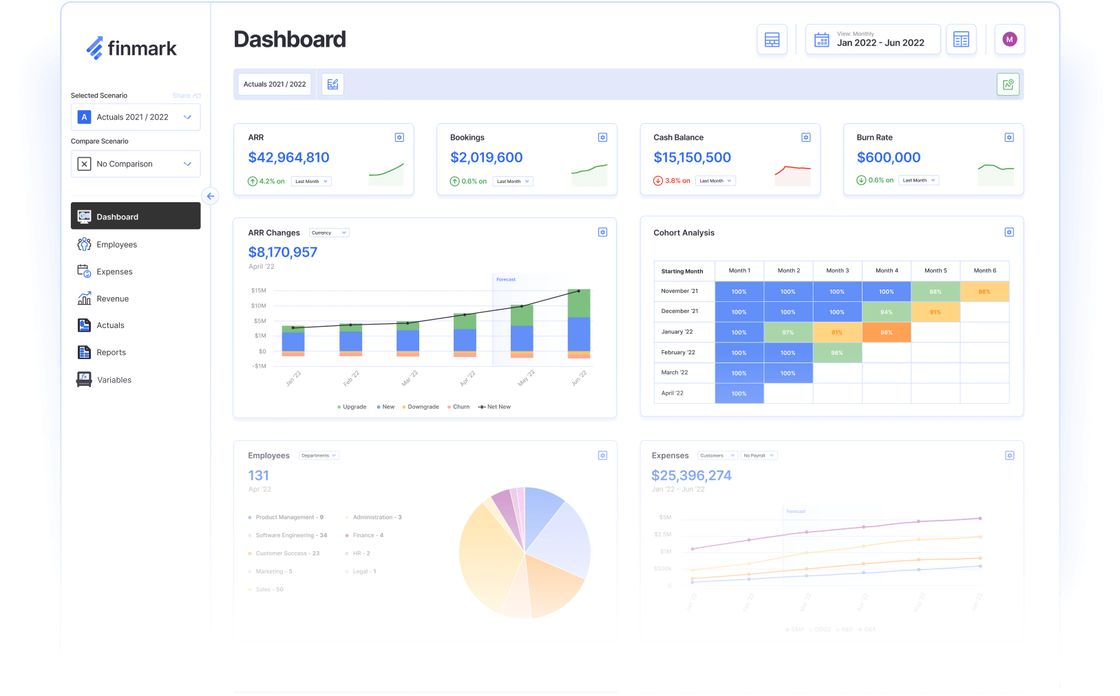
A great way to visualize net revenue retention and churn rate is a cohort analysis. Cohort analysis buckets users into periods of becoming customers, like month of starting the subscription. It then shows how the net revenue retention or churn rate changes month-over-month.
Marketing Efficiency Dashboard
Metrics to Include
- Customer acquisition cost (CAC): The average cost of adding one additional customer; you can use a blended CAC (all marketing costs including salaries of team members) or use only direct costs like ad spend
- LTV to CAC ratio: A measurement of how effectively the marketing team is making revenue based on the cost of acquiring a new customer
- Cost per lead (CPL): The average cost of adding one additional lead
- Attributed new MRR: How much new monthly recurring revenue is generated in a period that is attributed to the marketing team
How to Use It
The marketing team of a SaaS company depends heavily on data to determine its strategy. They need clear information on how much they’re spending to acquire new customers and how much those customers are worth.
To quickly evaluate marketing efforts, you need to know the CLV (from the General Overview Dashboard) and customer acquisition cost (CAC). If the CLV is higher than the CAC, the marketing team is generating more money on a customer than they spend to acquire them.
You can make evaluating the profitability of the marketing team’s efforts even easier by combining CLV/LTV and CAC measurements into the LTV to CAC ratio. A ratio greater than one means you’re generating more revenue from customers than it costs to acquire them. A ratio below one means your campaigns are netting a loss.
Marketing is a game of trade offs between quality and quantity. Cost per lead (CPL)—especially relative to the CAC—helps determine whether that trade off is affordable.
For instance, if the sales team has too many leads that aren’t converting, the marketing team can check whether it’s feasible to spend more on higher quality leads.
Attributed new MRR shows how much new monthly recurring revenue the marketing team has generated. This is great for monthly performance goals and tracking progress.
Sales Dashboard
Metrics to Include
- Monthly sales targets: The sales goals you’re hoping to hit for a given period (like number of subscriptions, new MRR)
- Sales pipeline: The quantity of leads at each stage of the pipeline from first point of contact to final consideration
- Lead conversion rate: The percentage of leads that become customers (New Customers / Total Leads)
- Projected additional CLV/MRR: The projected amount of lifetime value or monthly recurring revenue if all leads in the pipeline convert at the historical conversion rate
How to Use It
The sales team of a SaaS company needs to make quick decisions on what their focus should be. Do they need to make a final push on leads at the bottom of the funnel? Or tend to new leads to progress them closer to a deal?
The purpose of this SaaS dashboard is to give the sales team all the information they need to prioritize their time effectively.
Monthly sales targets are the goals you want to achieve. These should always be available for quick reference paired with how they’re tracking to targets.
The sales pipeline shows how many leads are at each stage of the SaaS company’s pipeline. The pipeline varies by company. For example, the first stage might be collecting information, the second stage a trial, and the third stage a review call.
The purpose of the sales pipeline is for the sales team to know what kind of leads to focus on. If there’s a bulk of fresh leads, the team needs to allocate enough headcount to keep them moving through the pipeline or sales will slow down in the future.
By showing the projected additional CLV or MRR of the leads in the pipeline, the sales team sees how much money is potentially in the pipeline right now. If it’s getting close to the end of the period, the team can coordinate with the marketing team if there aren’t sufficient leads to hit their monthly sales targets.
Finally, lead conversion rate measures how effectively the sales team is converting leads to customers. This is another metric that’s best tracked with a line graph to show whether the team is getting more or less effective at converting leads.
Build SaaS Dashboards That Work For Your Business
One of the most powerful tools used by SaaS companies is data. But raw data is difficult to use and takes up too much time to find the valuable information.
With dashboards, any team in your SaaS company can track their performance, set goals, and make data-informed decisions.
With Finmark from BILL, you can create customized dashboards with your must-have metrics and KPIs, or get started out of the gate with pre-built reports. Easily create valuable reporting your teams will actually use to track the performance of your SaaS business.
Get started with a free 30-day trial.
Contributor
This content is presented “as is,” and is not intended to provide tax, legal or financial advice. Please consult your advisor with any questions.